
Brand Photographer’s "BIG FOUR" Secrets to a Gorgeous & Cohesive Instagram Feed That No One Tells You (It's NOT About Filters!)


Hey, I’m Liza. I’m a personal brand photographer and I’m here to give you the TOP SECRETS to creating beautiful, cohesive photos for your Instagram feed! Why would I do that?! Because I’m all for making things look prettier - I’m obsessed with all things visual - and because I believe in YOU even though I don’t even know you! If you want to use Instagram, I’m guessing it’s for GOOD and I want to help you STAND OUT because you are full of amazingness. I just know it. 💖
You want a cohesive look for all your photos, right?! YES! I know you do! You’re drooling over all those gorgeous Instagram feeds - the white & black aesthetics, the light and airy aesthetics & those moody & retro ones - AH! They have you like, “OMG, how do I DO THAT?”
So, you run off figure out what filters from A ColorStory everyone is using or you download Lightroom and get lost trying to figure out how the heck to purchase and install presets - and then, when you’re like, “Ok! I got my filters, my presets, I’m ready to rock!” and you apply them…and they don’t look quite right on every photo.
Once you learn about the BIG FOUR to consistency here in this post, you’ll be ready to find out if you’re accidentally REPELLING your ideal client on Instagram! This guide gives you instant insight on how to find out & what to do about it - and will give you clarity on what things to focus on in YOUR Big Four!
What’s up with that?! You were hoping that the FILTER would be the answer! But it’s not. Yes, it helps, for SURE, but ONLY if you have these things in place FIRST.
You need to have a consistent look to your photos BEFORE applying a filter or preset.
How do you do that?
You need to be consistent with AT LEAST THREE of the following BIG FOUR:
LIGHTING
LOCATIONS
COLOR
SUBJECT
If you can be consistent with each of these, you can end up with photos that produce feeds like these:
(We’ll break each one down in a minute!)


Let’s look at a feed that violates each category of consistency. And, you guys, all of these are PROFESSIONAL photos. So, even professional photos not put together thoughtfully will be a mess:

LIGHTING
If you’re posting photos with all kinds of light - bright daylight, sunset, indoors with lamps, diffused window light - you’re creating a lighting mess. Also, if you’re posting photos taken at all different times of day - early morning light, midday light, golden hour and blue hour (just after sunset) - you’re creating the same mess.
Let’s analyze the lighting in the feed here. In order from left to right, top to bottom, these are the types of light we’re looking at:
Direct sunlight
Diffused sunlight (but direct in the background)
Diffused, rainy day
Backlight
Direct, sunset
Dappled (mix of direct & diffused
Direct, sunset
Backlight, sunset
Indoor, lamps, early evening
Diffused, midday
Artificial light, night
Diffused, inside, morning
Direct, golden hour
Direct, midday
Direct, afternoon
When we choose to post so many different types of lighting on our Instagram feeds, it doesn’t matter how great the photos are, it starts to look a little messy.
It really helps if you can stick to 1-3 types of light at the same time of day. That will help your consistency IMMENSELY. Make sure the lighting you use conveys the message that you want - bright day is more fun, cloudy days and diffused light inside can be calmer for instance.
LOCATIONS
Want to know the biggest secret for consistency? As a brand photographer, I shoot all my clients in the same several locations and then they just use those photos OVER AND OVER. So, it might be: kitchen, home office, a green field and living room. If you travel and that’s part of your feed, you’ll notice that travel Instagrams also stick to the same TYPES of locations. So, beaches, boats and sand. Or buildings from around the world.
If we look at the same not-so-pretty Instagram feed above, we see that there are 15 different locations!! They range from backyards to a train track to a bee farm, boat in the Bahamas, living rooms and more! What kind of consistency can we find there?! Not so much!
color
Knowing your brand/feed colors and sticking to them is a HUGE piece of consistency.
Colors can show up in all kinds of places: backgrounds, patterns, clothing, props
You might have brand colors that are yellow, orange and blue, but only want them to show up in wardrobe choices, for instance.
It’s important to stick to a color palette that is pleasing to the eye (meaning, they all go well together) and that represents your brand style.
Once you know your colors, make sure you stick to those. Each photo doesn’t need every color, but the colors should show up together around your grid.
subjects
It’s important to keep the same or similar subject in your Instagram feed. If you take photos of kids and then adults and then cats and then mugs and then pillows - it’s going to get a little crazy! But if you can keep the same or similar FACES in each of your photos, you’re on a great path. There are lots of influencers and other personal brands that will travel around and thus won’t always have access to the same locations each time, but the fact that they still use the same kind of lighting, color palette and THEY show up as the subject of the MAJORITY of their photos, then consistency isn’t a problem!
Let’s look at a feed that’s consistent with the Big Four & see WHY IT WORKS:

LIGHTING:
Everything is diffused light.
When outside, this means it’s either cloudy outside or our subject is in the shade. When inside, this means all the lights are off and subject is lit by soft window light. (ie: sun isn’t directly streaming in)
LOCATION:
Three main locations throughout.
OUTSIDE: Colorful murals serve as different-but-similar backgrounds.
OUTSIDE: Coffee shop
INSIDE: Living room couch
INSIDE: Bedroom
Since inside was all her home, the aesthetic there is very similar.
COLORs:
MAIN: Blues, Teals, Orange, Yellow, White (even the dogs fit in to the white & orange/bown color theme!)
SUPPORTING POPS:
Red: her bag strap in a few and the Coca Cola fridge she’s sitting against, the words on her clutch. So that’s something that can come up now and then in small pops.
Pink: the “hello gorgeous” sign and some on the murals.
SUBJECTS:
It’s just her and her dogs the whole time!
Let’s look at another feed that’s consistent with the Big Four & see WHY IT WORKS:
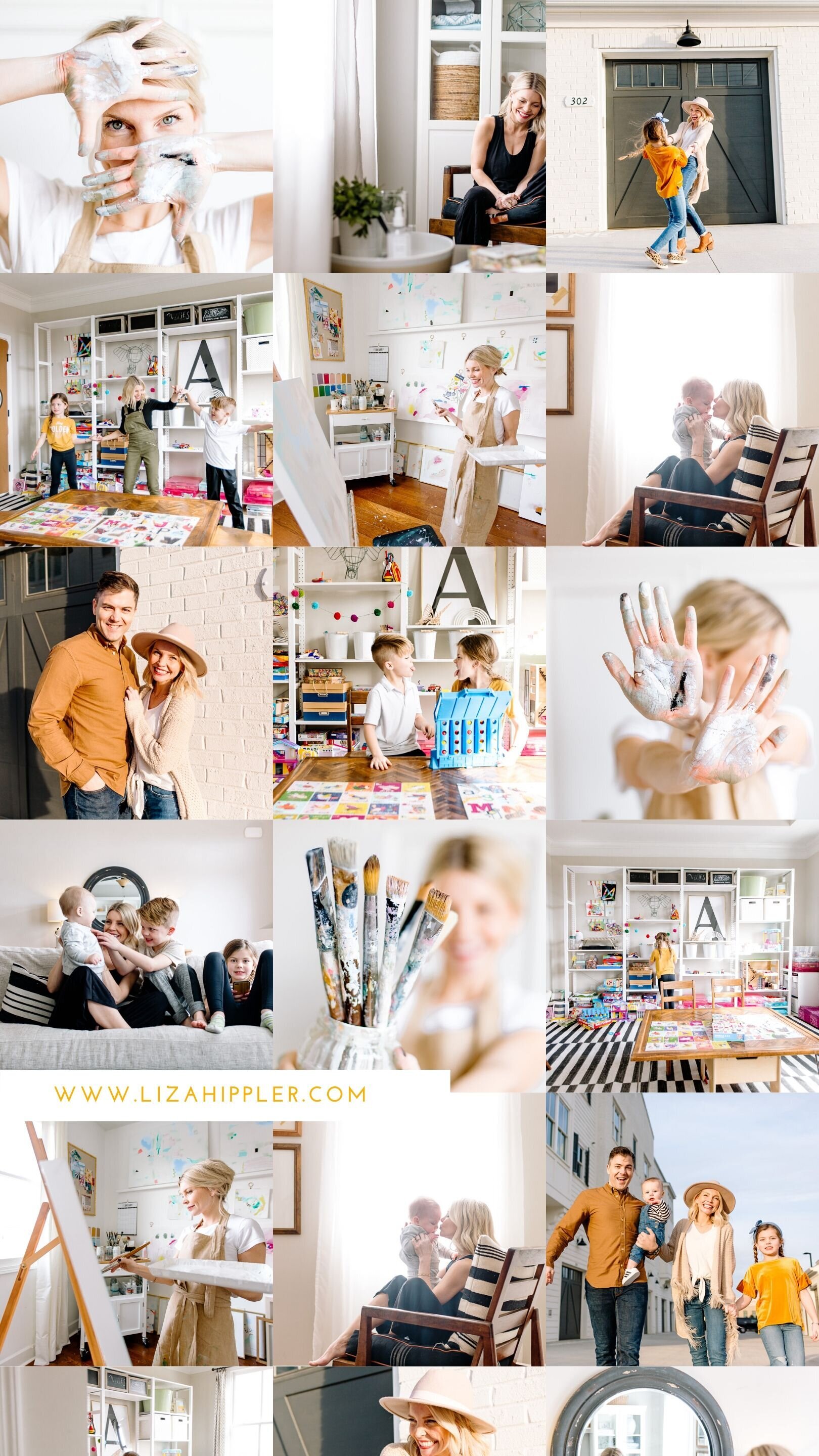
LIGHTING:
Mix of diffused light & direct outdoor light. Indoor is mid-day. Outdoor direct is late afternoon as the sun lowers.
LOCATIONs:
All indoor locations are her home & each room has a very clean white aesthetic with black accents. Pops of color look more like confetti than true blocks of color.
Outdoor location uses same black/white aesthetic with white brick and black garage doors. Keeps consistent with indoor color scheme.
COLORs:
MAIN: White, Yellow, Black, a neutral palette with confetti-style pops of bright colors. Color pops show up in playroom area and match with the color pops in her art studio & paint.
SUPPORTING POPS:
Blue Jeans & some army green.
SUBJECTS/PROPS:
Family, Family Connection
Her
Paint & Paint Supplies
Kids Toys
Let’s look at one more feed that’s consistent with the Big Four & see WHY IT WORKS:

LIGHTING:
Mix of diffused indoor & outdoor.
Late afternoon + early evening light.
LOCATIONs:
AirBNB apartment rental + common areas.
All one central location = consistency because apartment complex is decorated and designed cohesively.
Apartment room itself.
Oudoor common area.
Indoor common area, upstairs & downstairs.
COLORs:
MAIN: Yellow, Rose Gold, White, Woods/Camel
SUPPORTING POPS:
Blue Jeans & some greenery
SUBJECTS/PROPS:
Her
Laptop
Books
Bracelets
As long as you are consistent with AT LEAST THREE of THE BIG FOUR, you’re well on your way to a gloriously cohesive & gorgeous Instagram feed!
Q&A:
So what do you do if your look has been diffused light so far because you took photos on a cloudy day, and now you’ve run out of photos so you’re doing a new shoot and it’s SUNNY? Well, then you make sure you take a ton of photos in the new light (or in the new location or whatever) and then your IG will shift a bit, but it will still be consistent as you keep sharing the updated look! It helps if you only change 1-2 of the BIG FOUR at a time so the shift is gradual and natural!
Example of 3 out of the four: you might have different locations, but they’re all white aesthetic with bright natural light, keeping with colors in wardrobe and props, and keeping with same subject - and you’re STILL all set!
Now that you know about the BIG FOUR when it comes to consistency, you ready to find out if you’re accidentally REPELLING your ideal client on Instagram? This guide gives you instant insight on how to find out & what to do about it - and will give you clarity on what things to focus on in YOUR Big Four!
Now, for fun, let’s look at what happens when you take your colors and bring them into some quote graphics using the above feeds as examples!!


Is Your Instagram REPELLING Your Ideal Client?!
Get the workbook & find out!

Looking for more branding support & inspiration?! I’ve got options for you!
Come join my Create Your Badass Brand Facebook Group!
Submit your Instagram feed via IG DM to be reviewed by me! Weekly reviews in my stories!
Get the “Is Your Instagram Repelling Your Ideal Client” Workbook!